MyCredit is a companion application for Vancity members to manage their credit and set goals that encourage credit building. The aim is to better support member’s financial well-being and ease financial anxieties related to credit scores.
MyCredit is a companion application for Vancity members to manage their credit and set goals that encourage credit building. The aim is to better support member’s financial well-being and ease financial anxieties related to credit scores.
This is a 4 week client focused project created for a senior user experience design course — iat 438.
My Roles
Copywriting
Strategy
Research
Wireframing
Project Management
Team
Elena Hsu
Kristina Kim
Elizabeth Lo
Macguire Rintoul
Jordan Yep
Teaching Team
Russell Taylor
Stevie Nguyen
CREDIT SCORES
Domain Problem
56% of Canadians have never checked their credit score, and 31% don't know the steps to acheive a good score.
56% of Canadians have never checked their credit score, and 31% don't know the steps to acheive a good score.
BMO POLLARA SURVEY
Credit scores are one of the most important numbers in your financial life and could impact your credit cards, loans, leases, and mortgages. In discovering that over half of Canadians are unaware of their credential standing, we realized there was an opportunity to bring awareness to the importance of scores.
Our Opportunity with Vancity
“With 250,000 of them – close to half of our members – interacting with us almost entirely online or via our mobile app, we’re under pressure to deliver even more mobile and digital functionality.”
VANCITY 2017 ANNUAL REPORT
Vancity's current credit experience is buried in four different pages on their website, lending it hard for members to find the information they need in one place. Vancity made sense as a client not only because of their need for digital functionality, but because they are a values based cooperative. With their members always in mind, it would be a natural step for them expand their mobile and digital functionalities by implementing a credit focused app.
Framing Insights
FEAR OF CHECKING
Customers with lower credit scores tend to check their score less frequently.
FEAR OF CHECKING
Customers with lower credit scores tend to check their score less frequently.
LOW URGENCY, LOW IMPORTANCE
Many customers do not feel the need to check until it is time to apply for a loan.
Through our research we discovered two big insights to why people aren't checking their credit scores. The fear of checking was a driving insight that we found even people around us experienced and stopped them from finding out. As well, we found people have a tendency to only check their credit scores when needed for a big purchase or loan, lending it too late to improve or acheive a good score. These insights framed our project, leading us to ask:
How might we provide guidance that reduces financial anxieties by encouraging members and providing tools to reach their goals?
If members are given a place to view their credit scores easily, and encouraged start building their credit earlier, a fear of checking or waiting to find out their scores would lessen. Right now, members have to go out of their way to receive their scores, so it's easy to turn a blind eye.
Vancity's Member Segments
FINANCIALLY RESPONSIBLE
Members who have multiple credit accounts, financially responsible, and have credit scores above 700, which Equifax considers good.
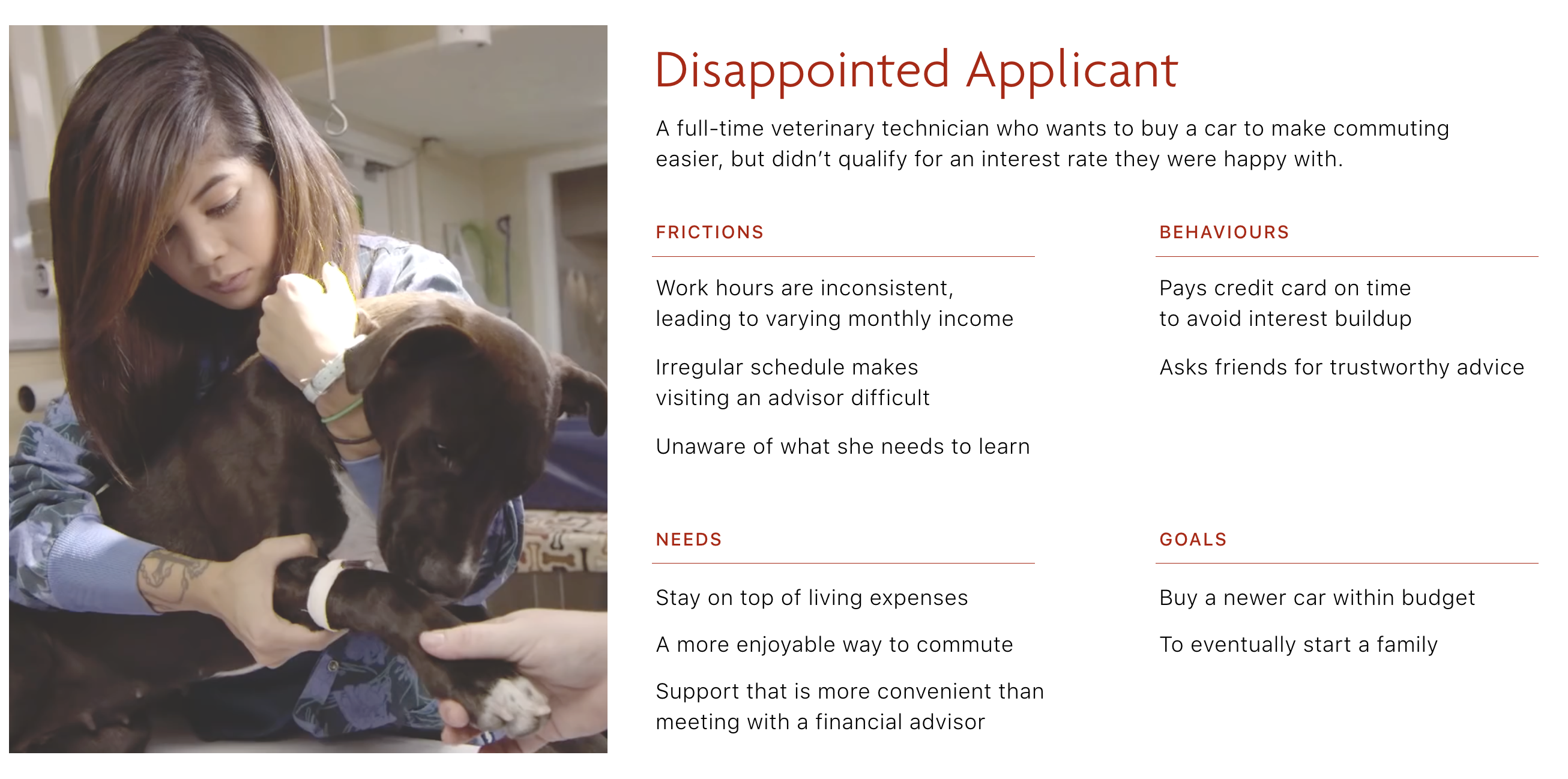
DISAPPOINTED APPLICANT
Members who have applied for loans but were not approved, or were not able to get the interest rate they wanted due to their credit score.
NOT NEEDED TO CHECK
Members who have not yet needed to apply for a loan or line of credit, so they don’t know the details of how to maintain good credit.
Persona
We chose the Disappointed Applicant as our persona so we could design for someone who needed to build their credit score, might be discouraged, and in need of some guidance.
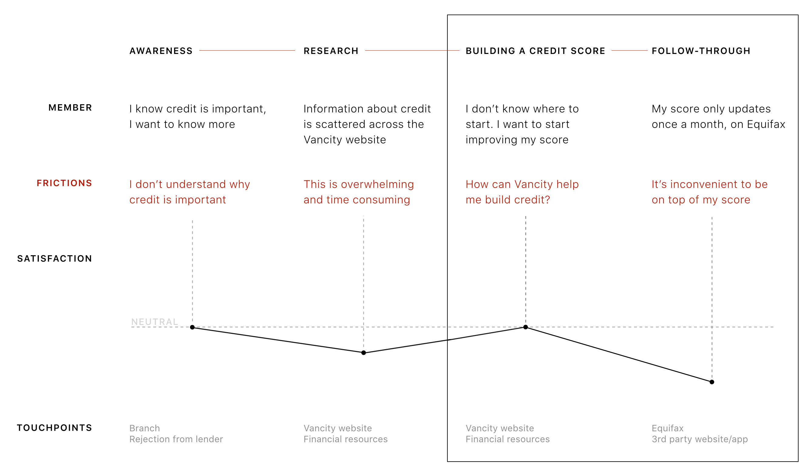
Journey Framework
We created a journey framework to map out the current experience today without intervention, and decided the "Building a Credit Score" stage and "Follow Through" were where we could intervene most meaningfully with the existing frictions. This makes sense for Vancity as a client, as we are working towards their goal for financial literacy stated in their 2017 annual report and working personally with their members.
PROCESS
Iterations & User Testing
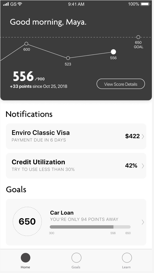
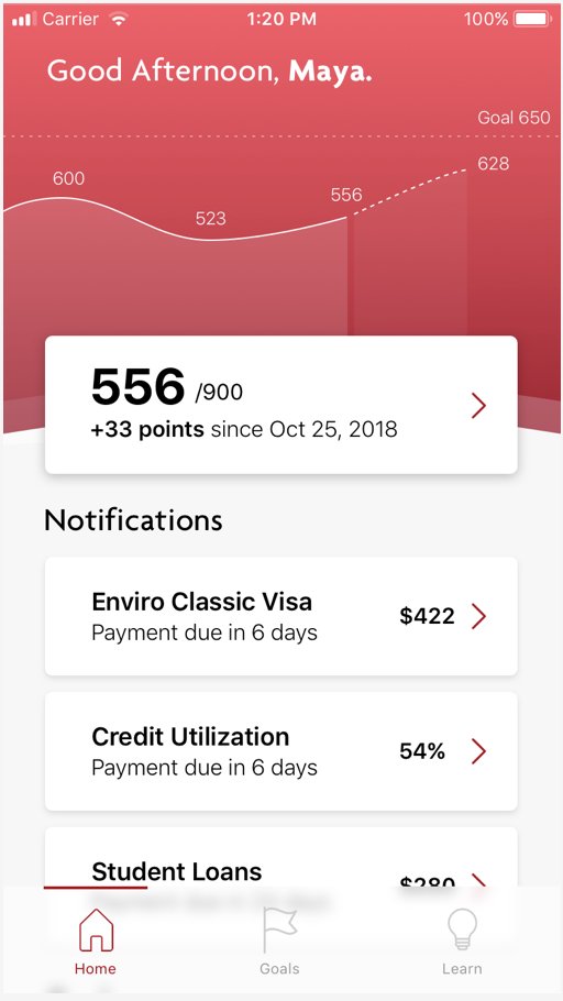
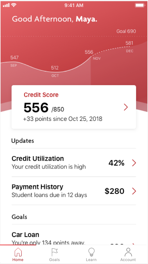
Since this was a 3 week timeframe iterations were made quickly beginning from the medium fidelity wireframe. Key changes that were made were separating the current hero content and differentiating it from the other cards. As well, the credit score history graph was changed to have soft curves, and always have a positive prediction in assumption the member would follow the suggestions for score improvement.
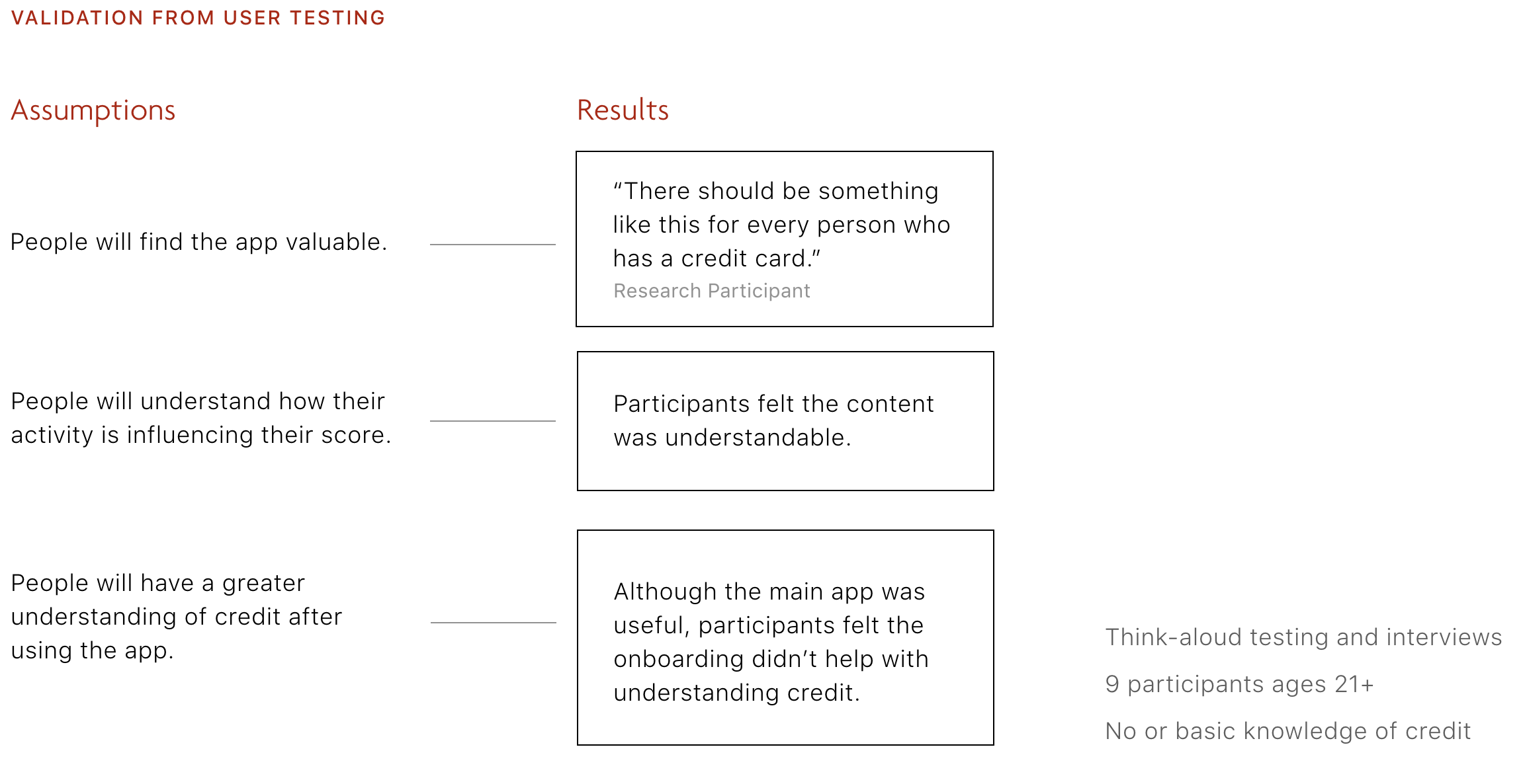
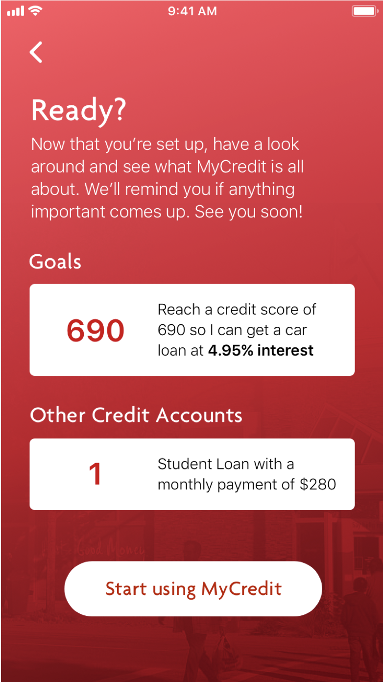
User testing brought up a concern which was that we didn't address what a credit score is in our onboarding. Funnily enough, we were missing the most important piece of information in the onboarding and the very thing we were trying to solve. We quickly iterated on the onboarding to make sure there was transparency with the data being used, and that definitions were addressed from the beginning.
DETAILS
Design Principles
Be Personal
As a local credit union, Vancity is recognized for their personal service, we wanted to let this shine through on their digital channels.
Be Clear
Using common language to guide all members so they can understand each step of their credit process.
Be Hopeful
Providing information upfront and always framing results positively to encourage members in improving their credit score.
Copywriting
Coming from a trusted financial institution, the copywriting had to credible and informative but also balance an encouraging and personal voice so members would want to come back.
PERSONAL CLEAR HOPEFUL
Multiple Accounts
Members can link credit accounts from other financial institutions via MX Technologies to receive payment reminders, view balances, and see how the account influences their score.
PERSONAL CLEAR
Notifications
Everyone manages their finances differently. MyCredit recommends actions specific to each member’s habits rather than providing generic information.
PERSONAL CLEAR HOPEFUL
Credit Explained
Learn explains the most important parts of credit, and shows members how their credit score is being influenced by their activity.
PERSONAL CLEAR
Actionable Tips
Curated information helps members reach their goal by giving them clear, achievable steps within a reasonable timeframe.
PERSONAL CLEAR HOPEFUL
Declining Score
Prediction of future growth that could be achieved provides encouragement and hope to build their score.
PERSONAL HOPEFUL
Celebration
Celebrating accomplishments and recognizing members for their efforts encourages them along their credit building journey.
PERSONAL HOPEFUL
Business Dependencies
Borrowell
Borrowell is a vendor that provides credit scores of individuals to financial institutions.
MX Technologies
Designed a Money Desktop Platform specifically for credit unions to give members full financial visibility.
Central 1
As a service provider to Vancity and other credit unions, Central 1 will need to collect and manage additional data from members.
Additional Staff
Vancity or their digital partners will require additional managers, designers, and developers to maintain a second mobile app.
If we can set members up with the tools and knowledge to build credit, we can give them to power to change their score.
Reflection
This project showed me what you can achieve in a short amount of time if you have proper time management. Our team had struggled in our previous project with finding our focus and running with it, so for this project our goal was to nail down the focus and treat every week like it was the final week. With this mentality we were able to achieve the level of detail and finish presented, but also iterate quickly on our UI, run effective sprints and have the time to map out the feasibility of our proposal.
This project also showed me the importance of user testing, how we could miss the very point of our app in our onboarding and not realize until it was a constant objection. But also, how our team's roles worked closely together collaboratively. I was constantly working alongside our visual designer on the UI with copy changes and arrangements of text for each page. Finding design principles that could fit seamlessly with Vancity's branding was a big milestone for our team, and was essential in creating a cohesive project designed for Vancity members in mind.